
I was glad I made the time last summer to visit the National Gallery’s exhibition of the pigments artists have used over the years. It was a fascinating business, and it is a bit sobering to remember just how much work the great masters of painting had to do before they even got to the stage of getting to the actual painting. It was also interesting to note that changes in the availability of raw materials and the technology for processing them have had a big influence on what could be done and therefore what was done.
Blue Pigment
The classic blue pigment is ultramarine blue which is made by grinding the mineral lapis lazuli. Until the 1920s lapiz lazuli was only mined in Afghanistan. It was well known to the Egyptians and other ancient cultures. With the fall of the Roman Empire trade routes to the East became less open and the availability of ultramarine became much scarcer. The name actually means from ‘across the sea’.
Medieval paintings only rarely use the very expensive ultramarine blue, but the vibrancy of Renaissance Italian painting was definitely owed much to its rediscovery. At the time northern Europe was relatively backward and had to rely on the much cheaper azurite for blue. This was mined near Lyons and when freshly mined is nearly as blue and vibrant as ultramarine. Unfortunately it isn’t as stable and tends to go greenish on standing.

Chemically the two ancient blue pigments are very different. Ultramarine blue is a complex mixture of atoms with the formula (Na,Ca)8(AlSiO4)6(S,SO4,Cl)1-2 which is enough to baffle a chemist, while azurite is simply copper carbonate.
The difference can be seen by comparing the stunning sky and blue clothes in Titan’s Bachuus and Ariadne from Italy with the almost contemporary Lady with a squirrel and a starling painted in Holland by Vermeer.
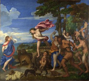

In fact Vermeer uses some ultramarine in his painting, but he paints it over the azurite. In his hands it works pretty well but it doesn’t match the exuberance of the Titan.
Blue colours were an early target for product development activities when chemistry started being applied to industrial processes in the nineteenth century. Prussian Blue, first synthesised in Berlin in the early eighteenth century but not available in quantity until much later revolutionised the colour palette available to painters like Gainsborough. He went completely bonkers with blue paint in this image of a young boy.

Prussian blue was a cyanide derivative. It wasn’t exactly healthy for the painters, but was probably no worse than another blue pigment developed about the same time. This was smalt, or cobolt blue, and was basically developed as a ceramic glaze. It wasn’t too successful as a paint component. The firing process the potters used rendered it stable and safe to handle. Used as a paint it was both toxic and faded.
Green Pigments
The most readily available green pigment before the modern era was verdigris. This is the green colour we have all seen on any copper that is exposed to the atmosphere for any length of time. The most famous example is the Statue of Liberty which when first forged must have been stunning, but which now has a characteristic green colour.

The most popular modern green pigment is made by grinding synthetically produced emeralds, a fact I am surprised they don’t use as a marketing point.
Tempera Versus Oil
Many renaissance paintings have faces that look distinctly green. This is the result of the way that they painted with a green base over which pinks and reds were painted.
Chemists will see straight away why the green colour that arises from the copper complex would last a lot longer than the organic compounds that were used in the reds.
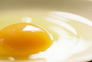
There were two techniques for making the pigments stick – tempera and oil. Tempera painting is done by grinding pigments into a water based protein source, typically egg. This is a quick and easy way of getting the pigment onto the painting and allows for fine brush strokes. It dries quickly, but it isn’t easy to overpaint it so generally it has a fairly low colour density. The first clue that a painting is tempera is that it generally has somewhat pastel shades.
Oil painting is a lot more involved, requiring the dispersing of pigments into oil which takes a lot more work. They also take a lot longer to dry, making the execution of large canvasses something of a job for a project manager. The pay off is the ability to get much greater colour depth, and to build up layers. It wasn’t for example really possible to get really good imitations of fabrics in paintings until oils were widely available.
Oil has a shinier appearance than the more matt tempura.
Yellows and Reds Pigments and Lakes
Yellow is the easiest pigment to get hold off if you aren’t too fussy. Ochre colours are available from clays and sands in most parts of the world. But if you want a really pure yellow you have to use things like red lead, the arsenic based redgar ad tin glaze. These are all somewhat dangerous, but the prize for toxic colourants goes to majolica.
Health and safety wasn’t as well established in the Middle Ages but people were nonetheless aware of the drawbacks of using such dangerous pigment ingredients in their original form. To overcome this problem lakes were developed. Lakes are pigments that are fired to lock in the colour into a harmless ceramic allowing them to be used for purposes where they need to be handled. This technique allowed painters to take advantage of the bright yellows and reds of lead, tin and antimony safely. They also made them available for use in cosmetics, in which they are still used. In fact the process of making lakes can be applied to other colours and allows colours that are water soluble to be used in oil based preparations.
The basic idea is still in use today and periodically gives rise to scares about lead in lipstick. The more toxic heavy metals aren’t used in large quantities any more, but are present at trace levels in some minerals that are made into lakes. The levels are safe enought in the first place, and production process in any case renders them quite harmless.
Red Colours From Plants and Insects
The process of producing lakes allowed naturally occurring colours to be used in art and cosmetics. Kermes is a red colour derived from the Kermes vermillio insect. It was used from early times to dye cloth, but it was not stable enough to use as a paint. Firing it into a lake enabled artists to take advantage of its hue, and also to cut down on the use of cinnabar. This is a red coloured ore of mercury which is quite simply ridiculously dangerous to handle.
(Having said that, Degas was still using cinnabar in combination with other red pigments in the early twentieth century – here’s a sample.)

Kermes was not the only natural colour. Cochineal beetles give a red colour that is still used as a food colour and which still turns up in colour cosmetics despite the objections of vegetarians. The official name is carmine. Red madder and brazil wood offer plant based alternative reds for the squeamish. The ethical status of stick lac is a matter of opinion. This is a byproduct of the production of shellac, a varnish that is extracted from insects. But the colour itself comes from the twigs of the trees on which the insects live. You can make your own mind up on that one.
Twentieth Century Pigments
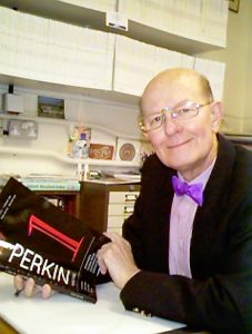
Some colours were simply difficult to produce. Purple was famously extracted from cuttlefish by an incredibly elaborate process that was so time consuming that the final product was hugely expensive. This made it a status symbol, and Roman emperors forbade anyone other than themselves from wearing it. This made it an early target for organic chemists. The first to produce a successful purple was Perkins in 1856, whose work led to a whole family of dyes based on analine. He named it mauve and was able to retire on the proceeds. He was later awarded a medal by the american Society of the Chemical Industries, which became an annual prize that is still being awarded today.
Bow ties dyed with the original batch of Perkin’s mauve are much sought after by enthusiasts of the history of chemistry.
The growth of industrial chemistry has created a huge range of colours of which previous artists could only dream. This has allowed much greater colour clarity and variety. But it has also changed art in other ways. The availability of pre-mixed paint in tubes was a revelation to artists used to having to meticulously prepare their paints before getting on to the real work.
As is always the case, a lot of the ideas and techniques of previous years lived on in the new technology. The medieval practice of making lakes was pressed into service to enhance the stability and usability of delicate organic compounds. And although the pigments are better and safer than ever, the oil used is still the same. Some natural products can’t be improved upon.
An artist whose career spans the introduction of ready made paint was Turner. His early work is very much classical studio based material taking subject matter from ancient history and myths. Later on he was able to get out and paint stuff from life. His Wind, Speed and Steam has a special place in my heart because I used to cycle under the bridge where it was painted on my way to work at one point in my life.
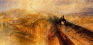
It captures a particular moment in time in a way that no earlier artist would have been able to with the materials available to them.
This trend that Turner started was picked up with incredible results by the Impressionists whose mode of operation was to go out and find a scene to paint at the time. This was only possible because they had a full palette of colours available to them.
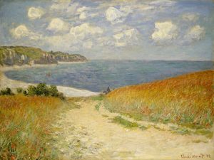
This seascape by Monet looks to me to have captured really closely the kind of colours you get on a sunny day in early summer in northern Europe. That he could concentrate on the art and forget about the details of the pigments he was using is in some ways as impressive as the skill he uses to produce the final product.
Support History Books Review by buying history books. It really is that simple.
More information at
http://www.nationalgallery.org.uk/channel/making-colour/